User:Pike/Boring at best
From Openmoko
m (→primary and secondary options) |
(→what is new) |
||
| Line 55: | Line 55: | ||
"52 messages, 4 unread", for an instance, couldnt it ? :-) | "52 messages, 4 unread", for an instance, couldnt it ? :-) | ||
| − | + | == what is new == | |
As little as possible :-D | As little as possible :-D | ||
Revision as of 02:22, 26 July 2009
Contents |
Boring At Best
Explanation:
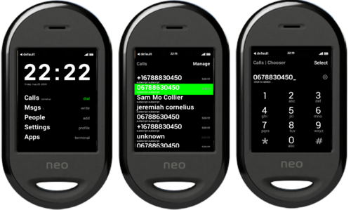
I love the black-and-white Paroli GUI, dubbed "Boring at Best" by someone in the mailinglist. It just needs tweeking; font sizes, alignments; it needs a few more concepts outlined - and it needs a sizzle - it should come alive when you start touching it.
To prove myself it could really look nice, I did these mockups. I'm not sure what to do with them; I have similar sketches in mind (and on paper) for the Launcher and Dialer and a settings screen; and some style guidelines too ..
Some explanation
Any good interface has it's "Rythm & Rhyme". On a single screen, your eye will catch the hidden grid and swerve around primary and secondary options in a split second. This works subliminally - you wouldn't even notice, but this is what makes an interface 'feel good'. This is even more true for phones, small screen, use it with one eye and one finger in a busy environment .. and between screens, your memory will recognize changes in that "Rythm and Rhyme", too. Yes, a good interface is much like a poem, or a piece of music :-)
.. so I was trying to find a grid, a basic layout, that fits all purposes. At the same time, this grid should be numberfriendly, as it has to be programmed in edje. You need "a few classes" of fonts, not a new font on every page. Same with colors, shades, etc.
So that's basicly what this was http://wiki.openmoko.org/wiki/Image:BAB-List-default-1.0-grid.png .. but it's already outdated :-)
Such a grid should include whatever options you might think of in the future - dialogs, extra buttons, etc .. so that's basicly this http://wiki.openmoko.org/wiki/Image:BAB-List-default-1.0.png
For example, this "big blocker bar" (a modal dialog) is not actually used anywhere, but if it *would* be, it should be there (there is a modal dialog in the "dial" and when "sending" an sms, btw). Same for the "informational bar" - a thing that should hide itself once you touch the screen imho - its not used anywhere - but if it would be, it should be right there. And hey, it could say "52 messages, 4 unread", for an instance, couldnt it ? :-)
what is new
As little as possible :-D But, as I'm sketching and using the phone, a few things are indeed new and needed imho.
avoid next,back
The "next", "back" paradigm doesnt really work for me. I want to know *what* "next" is. "back" is not always where I came from. And above that, I don't always know where I am (this happens particularly in the settings, currently). So I've changed "back" and "next" to a virtual "path" and an "action". There could be more actions, actually (eg in sms|read, you can "delete" and "reply" a message). If you click on an action, that should become part of your path in the next screen. For example, if you are in "Setting | Wifi", the main action is "Scan". In the next screen, the path should be "Settings | Wifi | Scan". Action and Paths are CamelCased.
avoid double top bars
the "panel" (the top bar) should be removed in all screens if we are in windowed mode imho, because you now get two rows of similar icons. Ergo, there can be nothing essential in Paroli's panel that's not in the Illume panel.
But there is one essential thing there now: the clock, used to return to the launcher. So we'd need a button in the interface to "close" a paroli app (like "msgs") when you are in windowed mode.
In fact, it should look like a "close" button: if you tap around Illume, you will find the "chooser" is still hanging around and not responding until you "close" the other screen.
So that's what the funny circle is in the 3rd image at http://wiki.openmoko.org/wiki/Image:BAB-List-default-1.0.png , a 'close button'.
show if the launcher is waiting
I also think the main screen, the launcher, should indicate it's waiting for the other app to quit. It would not harm if you are in fullscreen (since you won't see it) and it would be very beneficial in windowed mode. I have a screenshot of that, here ..
primary and secondary options
The most important thing is, I think, I differentiate between "primary" and "secondary" options:
The screen is divided in lines.
Each line can only have one primary, big, white, option. If you click it, the background color of the whole line quickly hilites before the screen changes.
Each line can have several secondary (small, grey, lowercased) options. If you click it, only the font color quickly switches before the screen changes.
I think this differentation is usefull, as it gives a user an idea about the "default" action - go forward - and several sideoptions - "delete that thing, go back" - without visually cluttering the screen.


